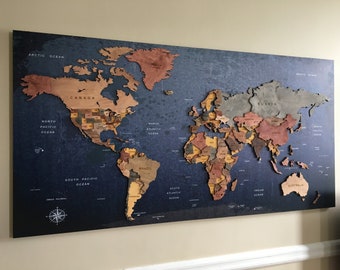


Large Oak Wood Framed Map of the online World With Beautiful Data Infographic Visualisation
-----------------------------
OUR FASCINATING PLANET
-----------------------------
Our world, and the people that inhabit it, is a fascinating and unbelievably diverse place whose vastly different and constantly evolving climates, faunas, geologies and geographies, natural resources and history define and shape the way we live and interact with one another. The effects on religions, languages, economics, politics, societal behaviours, or demographics as a whole, are at times evident and easily observable, but more often are subtle and obscure. Would you have thought that Uzbekistan or North Korea have amongst the highest literacy rates of any countries in the world? The US isn't even in the top 10!
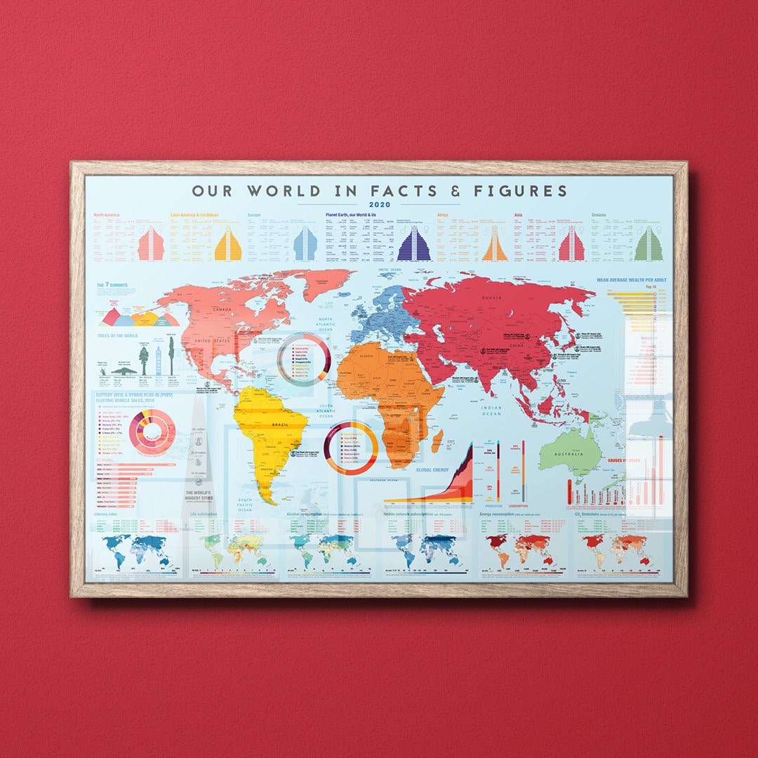
This striking and beautiful map of the world provides a snapshot into the world and its population today. While there is only so much that you can fit into an artwork, Our World in Facts & Figures attempts to condense some of the most important and defining facts and figures about this planet - and the nearly 8 billion people who live on it - into beautiful and easily digestible graphs and illustrations.
One thing is clear, this map will not just help your kids ace that Geography test at school, it will inevitably surprise and educate you too*. It's hard just glance at this map without ending up in a deep dive into some pretty obscure stuff… Did you know that in Micronesia only 1 in 5 people have a mobile phone? That's still almost twice as many as in South Sudan.
-----------------------------
DETAILS ABOUT YOUR MAP
-----------------------------
General: The map is geographically colour-coded into the world's permanently inhabited continents, excluding Antarctica. Along the length of the top of the map, high-level socio-economic, political, geographic, societal and demographic data are provided in the corresponding colours of the continents. Here, you'll also find information about Earth as a planet rather than as a place – i.e. its distance from the moon and sun, its age, mass and radius or even its average orbital speed.
The majority of the area below this is taken up by the equirectangular projection of the world (one of the simplest and most common projections, where distances along meridians are conserved). A mix of geographical data, such as the world's tallest mountains and trees, and demographic data, such as major religions and languages fill the gaps offered up by the space created by the world's six major oceans.
Along the bottom of the map are a fun selection of socio-economic, developmental and industrial indicators mapped on colour-coded scales across mini-maps of the world. Here you may be surprised to find that Nigeria is ahead of Germany in terms of per-capita alcohol consumption, or that three of four major Scandinavia countries feature in the top five happiest places in the world.
Political: The map carefully and accurately details countries with up-to-date** names (other maps are often out of date!), political borders and their capital cities. Where space permits, other major cities are annotated. For all cities with populations over 10 million (approximately the thirty largest cities), the current populations are indicated as well as those from thirty years ago, showing you how different cities have grown – or shrunk – over the decades.
*WARNING – hang your map in the dining room at your own risk. Map has shown to completely take over dinner conversation! ***
**One of the most useful but simple features on the entire map is the date at the top: 2020. With the rate at which the world is evolving, maps can quickly become either an inaccurate nuisance or a fascinating historic snapshot or window into how things were at a particular point in time. With many, many, many maps out there it can unfortunately be the former. Simply in order to figure out when it's from, you need to start figuring out which borders have moved, countries have sprung up or ceased to exist, cities have become capital cities or become ghost cities. Just last year, Burundi and Georgia moved their capital cities and the Kingdom of Swaziland changed its name to the Eswatini. Go on, take a quick look on Etsy and see how many of the maps correctly reflect these! If you can find one, or if you can find something on our map that needs updating, we'll give you 10% off! We're fascinated by the world and pretty up to speed on geopolitical changes, so we'll be impressed if you can :)
-----------------------------
SPECIFICATION & SIZES
-----------------------------
- 260gsm Epson Lustre Premium quality paper, luxury satin coated (gives a smooth, silky but matt feel)
- Giclée printed using large-format Inkjet printer for long-lasting, vibrant colours in ultra-high resolution
- Framed maps are hand-framed using solid oak and mahogany effect wood mouldings, depending on which colour theme you choose.
- Framed maps come with a crystal acrylic glazing, are mounted on a sturdy MDF backing and come with the conventional D-rings and cord attachment for hanging
- A1 Poster - 594mm height x 841mm width
- A0 Poster - 841mm height x 1,189mm width
- Framing adds 34mm around all edges
-----------------------------
SHIPPING
-----------------------------
-FREE UK DELIVERY on all products.
-FREE GLOBAL DELIVERY for all unframed posters.
-All orders are dispatched by the end of the following day, and generally arrive within 3 to 5 business days.
-All posters (i.e. if you buy it without a frame) come individually wrapped and carefully packaged in a brown, reinforced cardboard tube.
-All our framed maps are comprehensively protected and wrapped before being dispatched using Parcelforce in the UK, and DPD internationally.
-----------------------------
THE SMALL PRINT
-----------------------------
*All of our data, facts and figures are from verified, reputable open sources and are as up to date possible, as dated on the map if not from 2019/20. The vast majority of the data is from governmental and official sources such as the World Health Organisation and the CIA World Factbook. Special thanks are due to the Oxford University-based academic organisation Our World in Data, who have provided much of the information that's less readily available. For any particular questions regarding sources of specific pieces of data, please get in touch!
*Where territories and borders are disputed, we have taken a best-judgement approach, with a view of remaining politically neutral. We understand that not everybody may online agree with our judgement and we welcome feedback. Please get in touch if you believe there are justifiable grounds upon which the political annotation requires updating.
*Please read our privacy statement regarding handling of personal information